homepage visual preference study
BACKGROUND
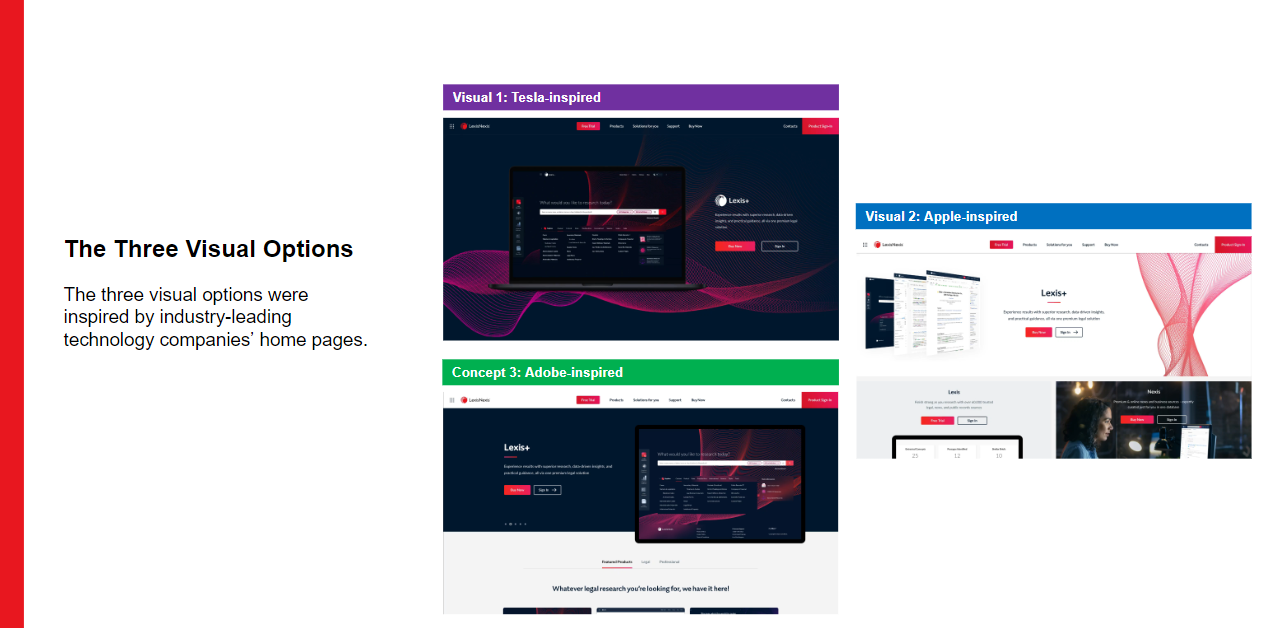
With the findings of the home page concept test in mind, the Global Web & eComm team created three other designs focused on getting users’ feedback on preferences for the visual style of the home page. All three designs were inspired by industry-leading technology companies like Tesla, Apple, and Adobe:
RESEARCH PROBLEM STATEMENT/GOAL(S)
The team would like to learn which of the 3 design options created for the new LexisNexis homepage is most preferred by our customers. The most preferred design in this study will help narrow down key design decisions to inform how the new homepage will look and feel for new and existing users.
QUESTIONS/HYPOTHESES
To begin developing my research test plan, I worked with the stakeholders to understand which questions they needed to answer and what hypotheses needed to be validated with the research findings:
Question 1: Which of the 3 designs do our customers prefer? And why?
Question 2: Do the customers understand the content shown in each design?
Hypothesis I: Prospective customers will prefer the Adobe inspired design the most of the 3 options (tTesla inspired, Apple inspired, Adobe inspired design and layout options) because it displays the product options clearly.
Method
survey
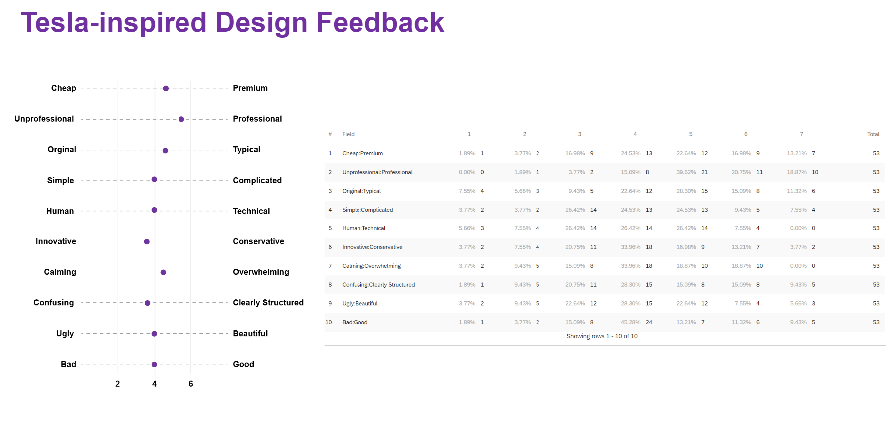
I created a survey to gain feedback from a larger audience on the new visual design options created for the new homepage. Each design was evaluated individually in the matrix shown on the right. Then they were asked to rank the 3 designs in order of preference to determine which design was most preferred by customers.
findings and recommendations
Findings
The survey received 53 total completions for the team to analyze users’ feedback.
When asked to rank their favorite of the 3 visual styles,
21 participants preferred the Tesla style,
12 preferred the Apple one, and
20 preferred the Adobe one.
*The slight difference in preference between the Tesla and Adobe styles indicates that further study will be needed to better understand users’ visual preferences.
Most of the participants felt the Tesla design was simple and looked easy to use, but many provided feedback that the design was too dark.
Participants found the Apple design to be cluttered and confusing. It ranked lowest of the 3 design options in this survey. However, the answer path section did receive positive feedback and was viewed as a useful feature.
Recommendations
The Adobe design was reviewed as simple and clear, but several participants shared that they felt the “Legal” and “Professional” categories for the product options were confusing.
Incorporate the answer path functionality into the Tesla-inspired design to enhance the product search capability to better serve new customers.
Scheduled a card sorting activity to better understand users’ feedback on product categorization in order to further improve the Adobe-inspired design.
Consider incorporating lighter content sections into the Tesla-inspired design to break up the dark screen to address users’ feedback on the design being too dark.
Plan a 2nd visual study to further test users’ visual preference between the improved Tesla-inspired and Adobe-inspired design.

